Results 1 to 4 of 4

Thread: new EB sigs

  1. #1
    Stranger in a strange land Moderator Hooahguy's Avatar
    Join Date
    Jun 2007
    Location
    The Fortress
    Posts
    11,852

    Default new EB sigs

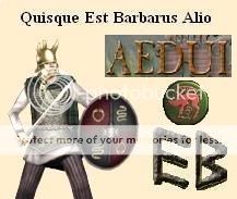
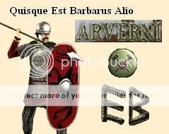
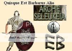
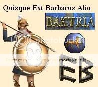
    well, in spare time away from EB over the past few months, i have been making some homemade sigs for the factions an EB. IIRC, only the saka and saba signatures would be allowed on the ORG pages, but you can put it anywhere else if you want. i have the getai one as my facebook profile pic......
    so here they are, just right-click, "copy image location" then paste wherever you want it to be!"
    enjoy!


    i tried to find units for the sigs that were only for that faction.....
    Last edited by Hooahguy; 02-05-2008 at 04:19.
    On the Path to the Streets of Gold: a Suebi AAR
    Visited:
    A man who casts no shadow has no soul.
    Hvil i fred HoreTore

  2. #2

    Default Re: new EB sigs

    They are very good. I like the units you selected. My suggestion would be to get different backgrounds and font colors for each factions.

  3. #3
    The Creator of Stories Member Parallel Pain's Avatar
    Join Date
    Dec 2007
    Location
    Sitting on the Throne of My Empires
    Posts
    380

    Default Re: new EB sigs

    Yeah, put them on coastal cities, harbours, plain cities, desert cities, mountain cities, plains, forests, mountains, hills deserts, coast, ships in the background, etc

    Each being where each faction came from. That would make them perfect.

    Otherwise, they are very good. Two thumbs up.
    Last edited by Parallel Pain; 02-05-2008 at 07:57.

  4. #4
    Member Member Pezlu's Avatar
    Join Date
    Jul 2006
    Location
    Gallia Cisalpina
    Posts
    170

    Default Re: new EB sigs

    They are very good, but I'd change a few things:

    - As the others said, add a background of some kind. A small frame (1-2 pixels width) around it would look nice IMO (it would separate the image from the context around it)
    - Try to crop the faction name entirely; the small cropped "rectangular background" around it doesn't look very good
    - "Quisque est barbarus alio" in Times New Roman ruins it a bit, you should use another font... also, I'd write it in ALL CAPS (and "V"s instead of "U"s) so it looks more "latin-like"

    Otherwise, excellent composition and unit choice.
    (from keravnos, for correctly recognizing the shield design of the Indohellenikoi Eugeneis Hoplitai as a hippocampus)

Bookmarks

Posting Permissions

  • You may not post new threads
  • You may not post replies
  • You may not post attachments
  • You may not edit your posts
  •  
Single Sign On provided by vBSSO