Page 1 of 2 12 LastLast
Results 1 to 30 of 32

Thread: Logo.

  1. #1
    Peerless Senior Member johnhughthom's Avatar
    Join Date
    Sep 2007
    Location
    Looking for the red blob of nothingness
    Posts
    6,344

    Default Logo.

    I don't like the new logo on my address bar and tab, it looks like there is a spider on my screen and it scares me. Please change it back to the non-scary red box with a design I could never quite make out. Thank you.

  2. #2
    Bureaucratically Efficient Senior Member TinCow's Avatar
    Join Date
    Mar 2004
    Location
    Washington, DC
    Posts
    13,729

    Default Re: Logo.

    Quote Originally Posted by johnhughthom View Post
    I don't like the new logo on my address bar and tab, it looks like there is a spider on my screen and it scares me. Please change it back to the non-scary red box with a design I could never quite make out. Thank you.


    You prefered the red blob of nothingness to a clear logo-version of the mask which was inside the red blob of nothingness?


  3. #3
    Senior Member Senior Member Yeti Sports 1.5 Champion, Snowboard Slalom Champion, Monkey Jump Champion, Mosquito Kill Champion Csargo's Avatar
    Join Date
    May 2005
    Location
    Vote:Sasaki
    Posts
    13,331

    Default Re: Logo.

    kind of looks like a tree to me...
    Quote Originally Posted by Sooh View Post
    I wonder if I can make Csargo cry harder by doing everyone but his ISO.

  4. #4

    Default Re: Logo.

    I like it. Much needed progress appears to be being made on multiple fronts!

  5. #5
    Peerless Senior Member johnhughthom's Avatar
    Join Date
    Sep 2007
    Location
    Looking for the red blob of nothingness
    Posts
    6,344

    Default Re: Logo.

    Quote Originally Posted by TinCow View Post


    You prefered the red blob of nothingness to a clear logo-version of the mask which was inside the red blob of nothingness?
    Yes. Luckily I still have my red blob of nothingness in my bookmarks toolbar, you can't get it there.

  6. #6
    Bureaucratically Efficient Senior Member TinCow's Avatar
    Join Date
    Mar 2004
    Location
    Washington, DC
    Posts
    13,729

    Default Re: Logo.

    Well, if anyone with graphical skills would like to try and make a better icon, the staff will consider using it. The current black mask version was the best we were able to come up with.


  7. #7
    Peerless Senior Member johnhughthom's Avatar
    Join Date
    Sep 2007
    Location
    Looking for the red blob of nothingness
    Posts
    6,344

    Default Re: Logo.

    Nah, I'm only joking, it's fine. Just got used to the "red blob of nothingness" being the org's symbol.

  8. #8
    Liar and Trickster Senior Member Andres's Avatar
    Join Date
    Jul 2006
    Location
    In my own skin.
    Posts
    13,208

    Default Re: Logo.

    You should be glad. The alternatives were a picture of a lasagna "best used before 02/03/1999" and TinCow's unshaved face on a Monday morning, before his morning coffee .
    Andres is our Lord and Master and could strike us down with thunderbolts or beer cans at any time. ~Askthepizzaguy

    Ja mata, TosaInu

  9. #9
    Peerless Senior Member johnhughthom's Avatar
    Join Date
    Sep 2007
    Location
    Looking for the red blob of nothingness
    Posts
    6,344

    Default Re: Logo.

    AH! Did you somehow hack into my computer and change the logo on my bookmark tab TinCow? It's just changed to the new one... I knew I shouldn't have taunted a lawyer.

    Gah, it's so confusing, I click bookmarks by logo and keep panicking thinking I've lost the org.
    Last edited by johnhughthom; 05-13-2011 at 23:05.

  10. #10

    Default Re: Logo.

    The cult of the "red blob of nothingness" are legion... lurking in the shadows, waiting to strike, waiting for our time to come again when the red blob shall rise once more and rule on high! You have been warned!

    *returns to shadows*

    *emerges from shadows*

    So the mask was actually inside the blob? That's a revelation in fact - all these years and I thought it was a slab of lasagne best before end 02/03/1999...

    *returns to shadows*

  11. #11
    The Rhetorician Member Skullheadhq's Avatar
    Join Date
    Apr 2008
    Location
    Antioch
    Posts
    2,267

    Default Re: Logo.

    I don't like the new logo either, I have a black firefox theme nd can barely see it in my bookmark bar, so I overlook it constantly.
    "When the candles are out all women are fair."
    -Plutarch, Coniugia Praecepta 46

  12. #12

    Default Re: Logo.

    Quote Originally Posted by His Camelness
    So the mask was actually inside the blob? That's a revelation in fact - all these years and I thought it was a slab of lasagne best before end 02/03/1999...
    The Caravel Mod: a (very much) improvedvanilla MTW/VI v2.1 early campaign

    Please make sure you have the latest version (v3.3)
    Since v3.3 the Caravel Mod includes customised campaigns for huge and default unit settings

    Download v3.3
    Info & Discussion Thread

  13. #13
    Bureaucratically Efficient Senior Member TinCow's Avatar
    Join Date
    Mar 2004
    Location
    Washington, DC
    Posts
    13,729

    Default Re: Logo.

    Quote Originally Posted by Asai Nagamasa View Post
    So the mask was actually inside the blob? That's a revelation in fact - all these years and I thought it was a slab of lasagne best before end 02/03/1999...
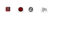
    Yep. Here's an enlargement of the icon:


    Quote Originally Posted by Skullheadhq View Post
    I don't like the new logo either, I have a black firefox theme nd can barely see it in my bookmark bar, so I overlook it constantly.
    While this is regrettable, it is a result of your own customization of your browser. With a black theme you will experience the exact same problem on every other website that uses a black icon with a transparent background, such as The Escapist and The Washington Post. The only way we can fix this for you is to add in a background color to the icon, but that will make it look worse for everyone else.


  14. #14

    Default Re: Logo.

    Joking aside the new type mask favicon is a big improvement over the old blob of lasagne. I'm probably biased though...

    Last edited by caravel; 05-16-2011 at 21:14. Reason: self moderated excessive humours that may not travel well

  15. #15
    Ranting madman of the .org Senior Member Fly Shoot Champion, Helicopter Champion, Pedestrian Killer Champion, Sharpshooter Champion, NFS Underground Champion Rhyfelwyr's Avatar
    Join Date
    Oct 2006
    Location
    In a hopeless place with no future
    Posts
    8,646

    Default Re: Logo.

    I don't like change, things were better back in the day.

    I think though the image is too small for its detail so it appears kind of fuzzy. At least when it was red it was more homely, if you're going for the more modern see-through background approach then you have to pull if off right. I have the TWC logo right below the .org one and it looks a lot tidier.

    Still, nice to see people are taking action to improve things here, and everyone I'm sure has been noticing it.
    At the end of the day politics is just trash compared to the Gospel.

  16. #16

    Default Re: Logo.

    Change it back, change for the sake of change is counterproductive.

    If it's not broke don't fix it.

  17. #17
    Grand Patron's Banner Bearer Senior Member Peasant Phill's Avatar
    Join Date
    Feb 2006
    Location
    Somewhere relatively safe, behind some one else, preferably at the back
    Posts
    2,953
    Blog Entries
    3

    Default Re: Logo.

    What are the dimensions and pixels per inch requirements for the tiny logo?

    I want to make a try if you don't mind.
    Quote Originally Posted by Drone
    Someone has to watch over the wheat.
    Quote Originally Posted by TinCow
    We've made our walls sufficiently thick that we don't even hear the wet thuds of them bashing their brains against the outer wall and falling as lifeless corpses into our bottomless moat.

  18. #18
    Needs more flowers Moderator drone's Avatar
    Join Date
    Dec 2004
    Location
    Moral High Grounds
    Posts
    9,278

    Default Re: Logo.

    I think the favicon image file can be 48x48, but it needs to look good when shrunk down to 16x16.
    The .Org's MTW Reference Guide Wiki - now taking comments, corrections, suggestions, and submissions

    If I werent playing games Id be killing small animals at a higher rate than I am now - SFTS
    Si je n'étais pas jouer à des jeux que je serais mort de petits animaux à un taux plus élevé que je suis maintenant - Louis VI The Fat

    "Why do you hate the extremely limited Spartan version of freedom?" - Lemur

  19. #19
    Bureaucratically Efficient Senior Member TinCow's Avatar
    Join Date
    Mar 2004
    Location
    Washington, DC
    Posts
    13,729

    Default Re: Logo.

    Common sizes are 32x32 and 48x48, but it automatically scales according to personal browser settings and most browsers show at 16x16. So, you can make it larger, but no matter what size you pick the resolution you should be evaluating it at is 16x16.


  20. #20
    Grand Patron's Banner Bearer Senior Member Peasant Phill's Avatar
    Join Date
    Feb 2006
    Location
    Somewhere relatively safe, behind some one else, preferably at the back
    Posts
    2,953
    Blog Entries
    3

    Default Re: Logo.

    A first quick and dirty try:


    Any comments before I draw the logo pixel by pixel?
    Quote Originally Posted by Drone
    Someone has to watch over the wheat.
    Quote Originally Posted by TinCow
    We've made our walls sufficiently thick that we don't even hear the wet thuds of them bashing their brains against the outer wall and falling as lifeless corpses into our bottomless moat.

  21. #21
    Bureaucratically Efficient Senior Member TinCow's Avatar
    Join Date
    Mar 2004
    Location
    Washington, DC
    Posts
    13,729

    Default Re: Logo.

    Quote Originally Posted by Peasant Phill View Post
    Any comments before I draw the logo pixel by pixel?
    You don't need to be restricted to the mask logo, other stuff could work as well. My first attempts were trying to do something that just said "Org" in various fashions, but they didn't come out very well. This was one version, which I think is nice:

    But it doesn't look anywhere near as good at 16x16, as you can see in the following image where it is compared against some other drafts:


    I still think an "Org" logo could work somehow, I just haven't been able to figure out how.
    Last edited by TinCow; 06-06-2011 at 22:33.


  22. #22
    Hope guides me Senior Member Hosakawa Tito's Avatar
    Join Date
    Dec 2000
    Location
    Western New Yuck
    Posts
    7,914

    Default Re: Logo.

    I could go for a big blob of lasagna right now.
    "He is no fool who gives what he cannot keep to gain that which he cannot lose." *Jim Elliot*

  23. #23
    Grand Patron's Banner Bearer Senior Member Peasant Phill's Avatar
    Join Date
    Feb 2006
    Location
    Somewhere relatively safe, behind some one else, preferably at the back
    Posts
    2,953
    Blog Entries
    3

    Default Re: Logo.

    I actually really like that Org logo Tincow, even on 16x16. Simple is better on that tiny pic.
    Quote Originally Posted by Drone
    Someone has to watch over the wheat.
    Quote Originally Posted by TinCow
    We've made our walls sufficiently thick that we don't even hear the wet thuds of them bashing their brains against the outer wall and falling as lifeless corpses into our bottomless moat.

  24. #24
    Peerless Senior Member johnhughthom's Avatar
    Join Date
    Sep 2007
    Location
    Looking for the red blob of nothingness
    Posts
    6,344

    Default Re: Logo.

    Quote Originally Posted by Peasant Phill View Post
    I actually really like that Org logo Tincow, even on 16x16. Simple is better on that tiny pic.


    You mean that one? I like it as well, has nice homely feel, just like the org.

  25. #25
    Bureaucratically Efficient Senior Member TinCow's Avatar
    Join Date
    Mar 2004
    Location
    Washington, DC
    Posts
    13,729

    Default Re: Logo.

    Quote Originally Posted by Peasant Phill View Post
    I actually really like that Org logo Tincow, even on 16x16. Simple is better on that tiny pic.
    I do like the design, but I feel like the 16x16 needs some pixel by pixel editing to make it look a little cleaner. I feel like it looks a bit ragged.
    Last edited by TinCow; 06-09-2011 at 11:59.


  26. #26

    Default Re: Logo.

    More lasagne...

    Ekklesia Mafia: - An exciting new mafia game set in ancient Athens - Sign up NOW!
    ***
    "Oh, how I wish we could have just one Diet session where the Austrians didn't spend the entire time complaining about something." Fredericus von Hamburg

  27. #27
    Member Member classical_hero's Avatar
    Join Date
    Oct 2010
    Location
    Perth, Western Australia. GMT+8
    Posts
    945

    Default Re: Logo.

    Perhaps you guys could make an announcement to get people who are gifted in the art of making websites look spiffy, since I am sure there are people on these boards who have the passion to make visual improvements to the forum.

  28. #28
    Bureaucratically Efficient Senior Member TinCow's Avatar
    Join Date
    Mar 2004
    Location
    Washington, DC
    Posts
    13,729

    Default Re: Logo.

    Quote Originally Posted by classical_hero View Post
    Perhaps you guys could make an announcement to get people who are gifted in the art of making websites look spiffy, since I am sure there are people on these boards who have the passion to make visual improvements to the forum.
    Not a bad idea.


  29. #29
    Grand Patron's Banner Bearer Senior Member Peasant Phill's Avatar
    Join Date
    Feb 2006
    Location
    Somewhere relatively safe, behind some one else, preferably at the back
    Posts
    2,953
    Blog Entries
    3

    Default Re: Logo.


    here's 2 attempts to get the .org logo more crisp at 16x16.

    The first one is just plain black and white which is clearly to pixelated.
    The second one somewhat better, I think.
    Last edited by Peasant Phill; 06-11-2011 at 14:45.
    Quote Originally Posted by Drone
    Someone has to watch over the wheat.
    Quote Originally Posted by TinCow
    We've made our walls sufficiently thick that we don't even hear the wet thuds of them bashing their brains against the outer wall and falling as lifeless corpses into our bottomless moat.

  30. #30
    Bureaucratically Efficient Senior Member TinCow's Avatar
    Join Date
    Mar 2004
    Location
    Washington, DC
    Posts
    13,729

    Default Re: Logo.

    Do you guys really prefer that logo? Staff voted for the spider thing over that, but I am personally kind of fond of it.


Page 1 of 2 12 LastLast

Bookmarks

Posting Permissions

  • You may not post new threads
  • You may not post replies
  • You may not post attachments
  • You may not edit your posts
  •  
Single Sign On provided by vBSSO