


Having trouble coming to grips with how much Federal spending has exploded in the last six years? Boggled by the big numbers? The Heritage Foundation has done us all a favor by putting together pretty graphs. Enjoy. To the socialists in the Backroom: Isn't having the state control a large swath of spending, I don't know, bad? To the "conservatives in the Backroom: Isn't having the state control a large swath of spending, I don't know, bad?
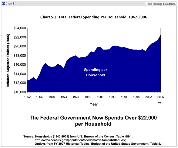
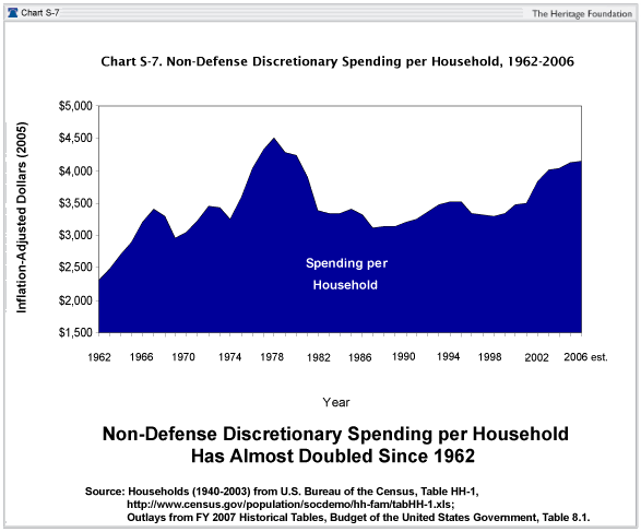
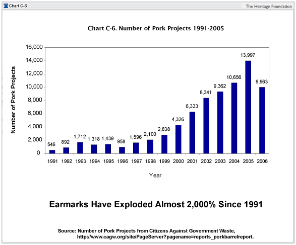
Sample graph:

 Reply With Quote


 and New Zealand.

 .
. 


Bookmarks