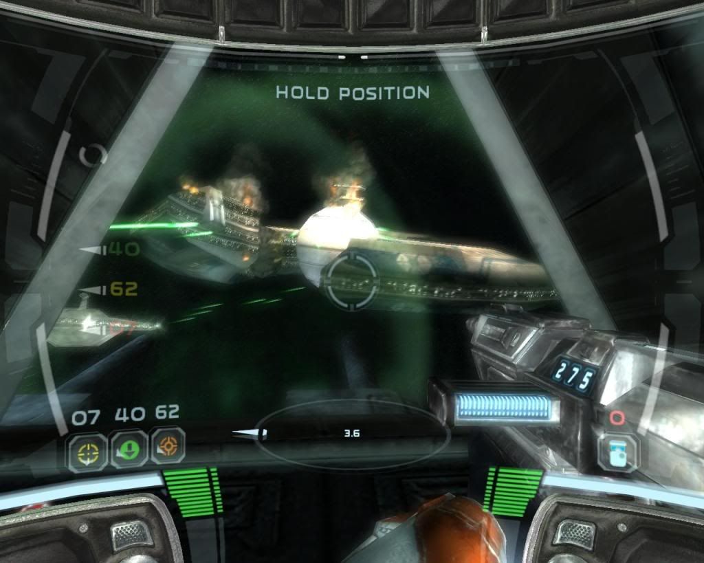
For anyone who knows... What game map is that in the screen shot? On the linked to article.
Last edited by Veho Nex; 12-03-2009 at 03:14.
Tho' I've belted you an' flayed you,
By the livin' Gawd that made you,
You're a better man than I am, Gunga Din!Originally Posted by North Korea
Star Wars: Knights of the Old Republic 1. Wonderful interface and controls. An example of how a PC and Xbox port can coexist happily and successfully.
Neverwinter Nights 1. What the HELL did they do to this in NWN2? Everything worked pretty damn well the first time around!
Star Wars: Republic Command. Agree with Monk, this was a well done interface. The game itself was rather unpretentious and fun.
Starcraft. As much as I am horrible at RTS's, they did a really good job polishing this game up. Everything had a keyboard shortcut, the UI was easy enough to understand and use.
Hall of shame
Elder Scrolls 4: Oblivion. THE poster child. They screwed this game up so hard it physically hurt me to try and play it. Good lord. Even WITH the darnified mod, it's still damn awful. Complete opposite to KOTOR1, how NOT to do a dual PC/console port interface.
Dishonorable mention: Fallout 3. More of the same Bethesda, more of the same. *sigh*
NWN2. Corollary to NWN1 above. They really, really screwed this up royally.
Fallout. Not intuitive at all, inventory system was bollox. Loved the game, but ugh.
Dead Space does it brilliantly. The Silent Hill 're-imagining' for the Wii may be a contender.
Universal Combat definitely has the worse.
Days since the Apocalypse began
"We are living in space-age times but there's too many of us thinking with stone-age minds" | How to spot a Humanist
"Men of Quality do not fear Equality." | "Belief doesn't change facts. Facts, if you are reasonable, should change your beliefs."
I didn't like it. It was hard to navigate without the map, and they intentionally made it so that you couldn't do combat with the map out. It was like the Doom 3 flashlight, except that at least that flashlight mode had a purpose: force you to walk around either in the dark, or unarmed, both of which heightened the tension. The FarCry 2 map just seemed like an intentional hindrance to the player without any purpose behind it.
Since the NWN games have been mentioned several times, I will say that there was one aspect of them I liked. I can't remember which game did this, but I remember that one of them allowed you to have totally customizable toolbars to put feats, skills, spells, etc in. I recall having three separate bars in different areas for different things, which I found to be very organized. There's a lot to be said for a UI that lets you configure it however you want.
I really liked that feature because I like to have all my spells/health potions/abilities on a quick bar for me to hit in combat. I don't like it when the number of things I can put in my quick bar is limited to 1-0 for the numbers on the keypad because then I always end up going into my skills sheet or inventory which is distracting. I was hoping that Dragon Age would use the multiple quickbar system, but I'm ok with the stretchy quickbar because I can get all of the stuff I need to use in combat on it.
I actually liked the Far Cry 2 map (felt very immersive, even if it was sometimes a bit tricky). The real problem was the infinite checkpoint/baddies which ground you down.
As a historical marker, I'd nominate Falcon 3.0's padlock view function. I'm not 100% sure, but I think that might have been the first usable padlock view system in an air combat sim. That was a revolutionary feature for flight sim UI's, both civilian and military.
The first NWN interface took a little time to get used to, but it was a great design.
Deadspace was a functional and visually interesting UI, but part of that was how appropriate it was for a sci-fi scenario like that. I can't see it being adopted more widely for something like Mount & Blade.
In the category of recent strategy games, I thought Dawn of Discovery had a nice minimalist interface that didn't get in the way, and still allowed easy access to information and control. There was a nice feature where you could go into a sort of cinematic view mode for a closer look at the game world. It satisfied the itch to see eye candy, while allowing the main view to be more functional at the strategy level.
One problem with a "Best Game UIs" thread, is that some of the best ones don't really stick in the memory, because they did their job so well.![]()
Feaw is a weapon.... wise genewuhs use weuuhw! -- Jebe the Tyrant
Good point, Zenicetus.
I think that the Total War UI (or at least the basic battle UI) may deserve a mention. It's clunkier than some mentioned in the thread, but for the most part after a few battles (or the excellent tutorials) you didn't have to rely on the buttons much at all and it became second nature.
Bookmarks